<Animations are, almost, always not the move>
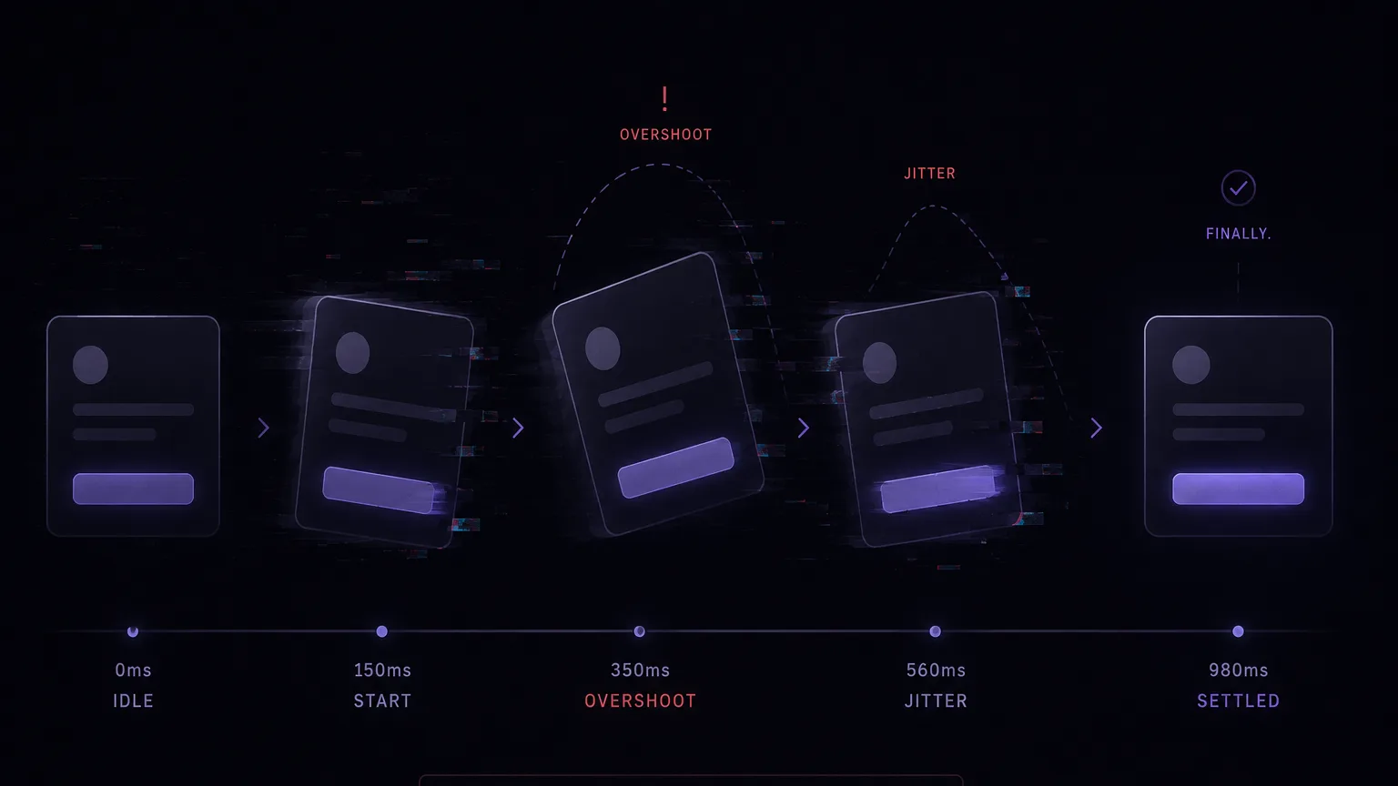
Modern-day websites seem to have a lot of unjustified animations. I believe every animation should be packed with a justification to be there, even for decorative purposes. In the first place, animations are UI elements, or a way to express UI elements, that have to deliver a UX purpose.
The sunk-cost trap
A designer stayed up all night to design a freaking sick animation, then handed it to a developer to implement it. Both of them thought this would be so cool, because it took them a ton of time to implement and refine. They thought everyone who saw it would instantaneously appreciate the effort that was put into it. Inside the end-user’s mind, he might like it at first glance, but when it affects his experience in the app, he won’t like it so much.
Animations always give this wow effect and make everything feel harmonized, but I would rather just sign in to my account than wait for the popover to finish its acrobatic flip. Don’t get me wrong, I like the acrobats, but at this moment I like to just sign in quickly more.
What this looks like in the wild
You don’t have to take my word for it. The Nielsen Norman Group ran a usability study on scrolljacking, the trend where animations hijack how a page scrolls. An entire page on Crypto.com used it, and every participant who landed on it got disoriented. One person got so lost he had to scroll back through the whole thing to figure out where he was, and called it “a hassle.” That’s the acrobatic flip at full scale: motion that someone was proud of, costing real users real time.
Now the opposite. Look at Stripe’s Pay button: click it, and it animates from its normal state, to a loader, to a confirmation checkmark as shown in Figure 1. One small element pulls triple duty: button, loading indicator, and “your payment went through,” all in the same spot. Nobody resents that animation, because every frame of it is telling you something you needed to know.

That’s the whole line, and it’s not really about taste. The useful test is simple: does the animation communicate something functional, or is it just decoration? A hero section that swoops in on page load is decoration. A spinner is communication. If it’s the second kind, keep it. If it’s the first, you’re spending the user’s time to show off.
The one animation nobody resents
Animations are amazing when they deliver a UX benefit. The most basic animation we see every day is the loading spinner, and we might not even realize it’s an animation. It’s a genius example of a functional animation doing its job. It serves the purpose it was made for: adding motion to the screen, telling you that we’re moving things in the back and it’s moving forward to you. Maybe part of its genius is that we don’t feel it’s an animation. It’s just embedded in the UX flow, so it doesn’t force any extra, unnecessary distraction.
When the fix is deletion
Some developers may optimize for how to fit their sick animation into the app, trying to make CSS-first tricks and solutions to adopt it into the app and accept it as technical debt, let alone conceding to keep it partially broken, because it’s so cool and people will still like it, since this last broken move ain’t a big deal. But actually, they don’t realize that this broken millisecond is a huge turn-off. Animation smoothness is what clicks once you see it, and breaking that smoothness gives you the Nah moment. Most of the time, the solution is just to remove it.
In the good old days, we didn’t have animations at all, and our apps were reliable, rock solid, and functional. An app without animation will work perfectly, but the opposite won’t necessarily hold.